Color and Texture Choices to Define Shared Spaces
Choosing color and texture sets the tone for shared living spaces, shaping perception, comfort, and how people move through a room. This article explains practical approaches to pairing pigments, materials, and finishes with layout, seating, lighting, and storage so communal areas feel cohesive, functional, and adaptable to different uses.

Shared spaces rely on careful decisions about color and texture to support comfort, circulation, and purpose. Thoughtful choices work alongside layout and seating to create clear zoning while balancing scale and proportion. This article outlines how color, textiles, lighting, storage, acoustics, ergonomics, and sustainability can be combined to define areas in a shared room without overwhelming the senses.
How does layout establish zoning and focalpoint?
A room’s layout is the backbone of effective zoning. Placing seating to face a clear focalpoint—whether a fireplace, media wall, or window—helps define the primary gathering area. Use rugs, changes in flooring material, or a shift in color palette to mark transitions between zones so traffic flows naturally and distinct uses don’t compete.
Complement layout with proportion: larger furniture and deeper tones can anchor an area, while lighter hues and slimline pieces keep circulation paths open. Consider scale of both furniture and textiles so a focalpoint isn’t overshadowed or crowded, and ensure pathways remain unobstructed for everyday use.
What seating and ergonomics suit shared areas?
Seating choices determine how people interact and how long they’ll stay. Mix fixed and flexible seating—sofas, armchairs, and stools—to accommodate different activities. Ergonomics matters: seat height, depth, and back support should be comfortable for typical users, and arrange pieces so sightlines to the focalpoint and each other are clear.
Textiles play a role in perceived comfort; slightly softer textures invite lounging, while more structured fabrics support upright posture. When specifying seating, account for scale so pieces don’t dominate the room or feel diminutive relative to the overall layout.
How does lighting affect color and scale?
Lighting dramatically changes how color reads and influences the perceived size of a space. Natural light tends to reveal true pigments, while warm- or cool-toned artificial light can shift hues. Layer ambient, task, and accent lighting to maintain color consistency across different activities and times of day.
Use lighting to emphasize texture—grazing light on a textured wall, for example, creates depth and highlights the fabric or finish. Properly scaled fixtures ensure proportion: oversized pendants can make a zone feel intimate, whereas slender lamps support an open, airy feel.
How to use textiles and texture for acoustics?
Textiles help define zones while improving acoustics in shared rooms. Heavy curtains, upholstered panels, area rugs, and woven wall hangings absorb sound and reduce reverberation, making conversation easier in multifunctional spaces. Layer different textiles to balance softness and durability where needed.
Select fabrics with care for performance and maintenance: textiles with tighter weaves often resist wear in high-traffic seating, while looped or tufted rugs provide acoustic benefits. Combining tactile variations—velvet cushions with a nubby throw, for instance—adds visual interest without disrupting cohesion.
Where can storage and multifunctional solutions fit?
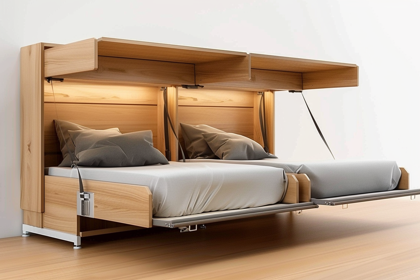
Integrated storage keeps shared spaces organized and flexible. Built-ins, concealed cabinets, and multi-use furniture (storage ottomans, benches with compartments) preserve clean sightlines and allow zones to shift functionally—study corner by day, media area by night. Color and finish choices for storage systems help them recede or become deliberate design elements.
When planning multifunctional pieces, factor ergonomics and accessibility so items used frequently are within reach. Sustainable material choices for storage and furniture can lower environmental impact and often increase longevity—look for durable finishes and responsibly sourced textiles.
How do proportion, material choices, and sustainability interact?
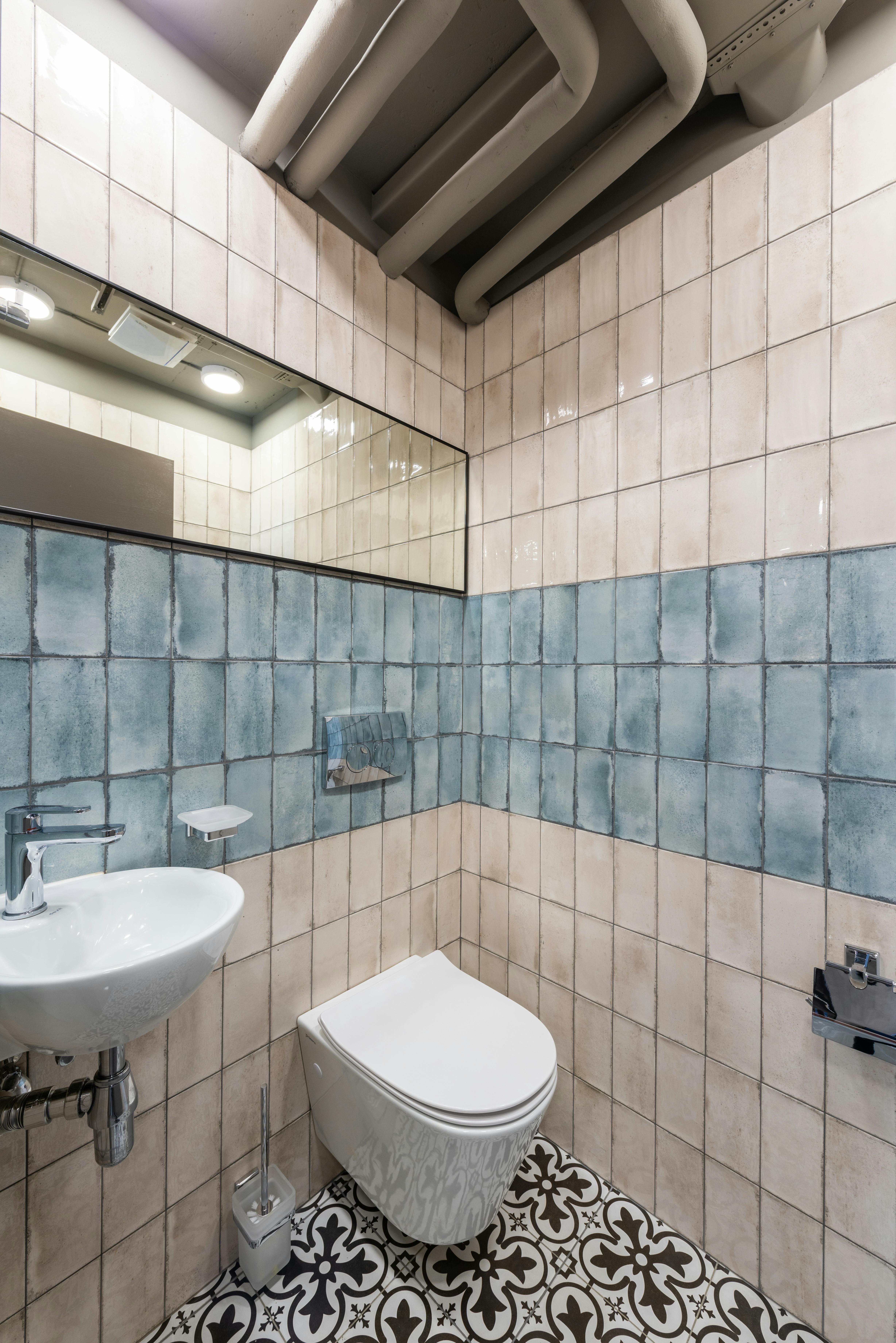
Proportion and material selection determine whether a palette feels harmonious. Natural materials—wood, stone, wool—offer textural variety and age gracefully, often supporting sustainability goals. Pair these with recycled or low-impact manufactured textiles to balance aesthetics and environmental considerations.
Sustainable choices should also consider longevity and reparability. Neutral base colors and textured accents allow you to refresh a room over time with new textiles or lighting rather than replacing major pieces, preserving both budget and resources while maintaining a distinct focalpoint.
Shared spaces are defined not by a single decision but by layered choices: layout that clarifies use, seating and ergonomics that invite interaction, lighting that shapes color and scale, textiles that manage acoustics, and storage that enables multifunctional living. Thoughtful combinations of these elements create coherent, adaptable spaces that meet practical needs and support long-term use.


